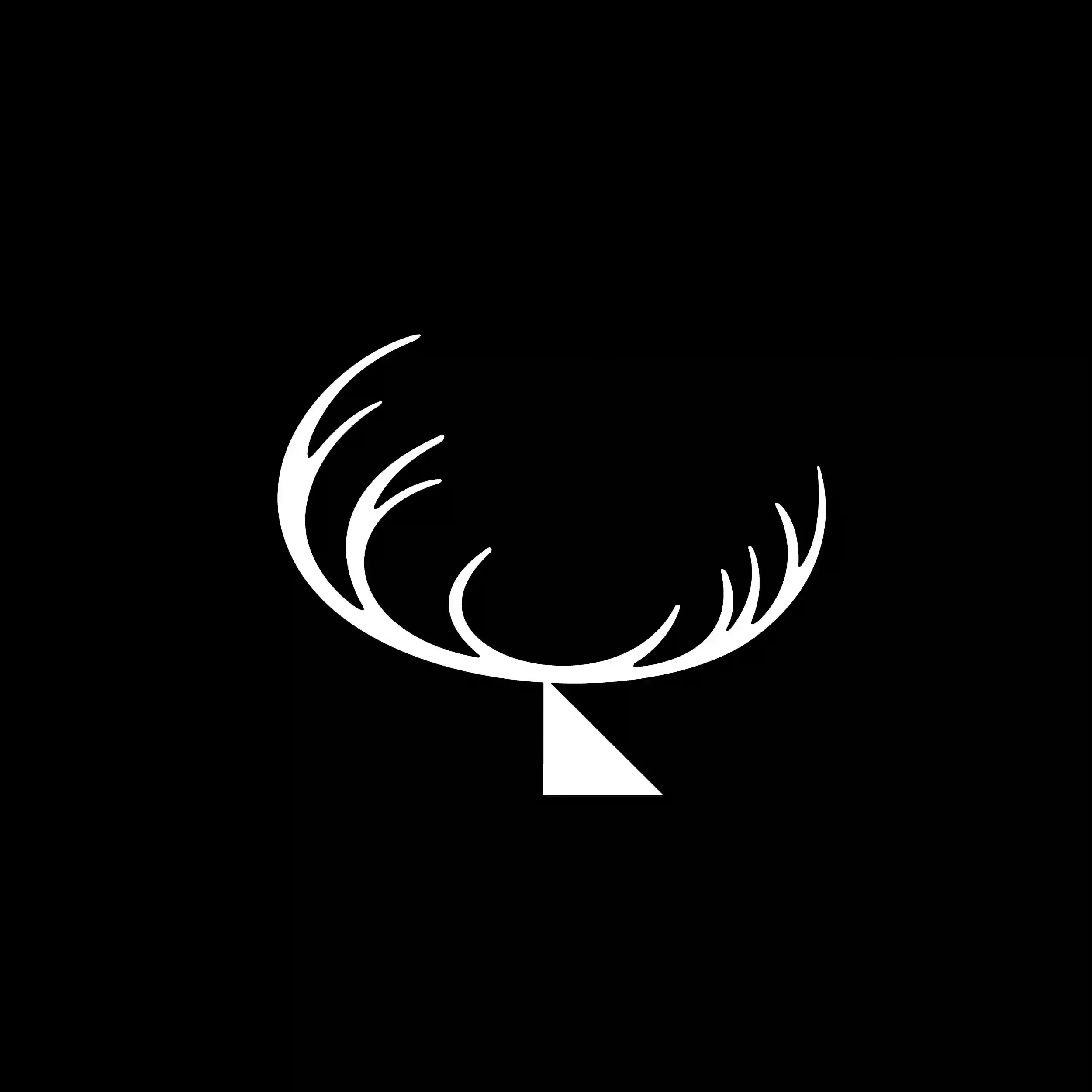
D
160px
Drawn by: Dwickie Widyatmoko
Sheet: 01 / Marks
Small marks, big jobs.
Type a letter.
No. 04 / Logos
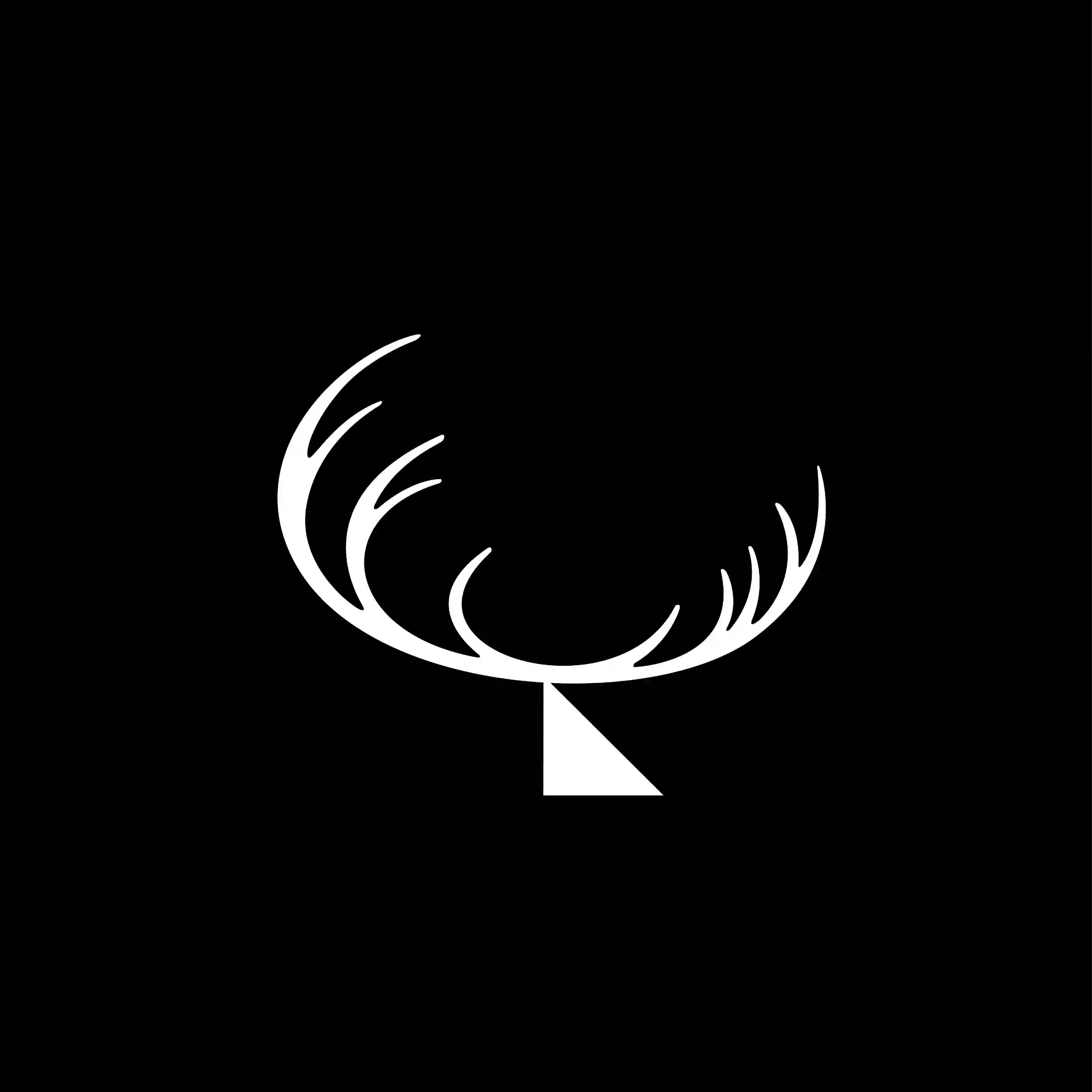
A lowercase d that holds up at 16 pixels and on a shopfront. I will find the mark already hiding in your name.
What you can get
Tap a tile to see an application.
How it's made
- 01
Discover the letterform
Finding hidden geometry in your initials or name structure.
- 02
Grid and geometric discipline
Constructing arcs, circles and tangents so the mark stays solid.
- 03
16 pixel legibility test
Shrinking the mark down to browser favicon scale to verify clarity.
- 04
Vector package delivery
Clean SVGs, mono lockups, reverse colourways and usage sheets.
What I need from you
- Company name, project title or monogram letters
- Tone: understated, geometric, bold or heritage
- Primary context: digital app, packaging or storefront sign
- Any existing colour rules to respect
Questions
How do you verify a mark works small?
Every mark is tested down to 16 pixels. If lines blur or spaces fill in, the geometry is simplified.
Do you deliver vector files?
Yes. Clean SVGs, EPS and master Illustrator files with zero stray points.
Can a monogram be animated later?
Because it is constructed on clean geometric paths, it is ready for motion.
How many concepts do we start with?
I present three focused directions with distinct structural ideas.